Recently, Facebook has redesigned the format of Facebook pages. Users are wondering whether and how it can contribute to something meaningful.
If you are the admin of a Facebook page, you must be wondering what happened to the layout of your page. Let us have a look at the new changes and the important things regarding this change that deserve to be noticed.
Good things about the new layout of Facebook pages:
-
- Apps still visible on the page:
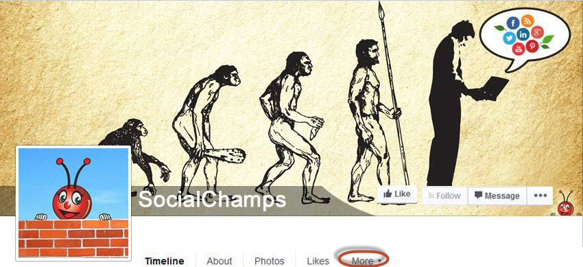
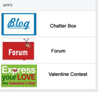
On the page, Apps are accessible under the “more” drop-down button. They are also displayed in the same format as they are today (with the tab image and app title) in the left sidebar. You can scroll a little to see them. On some pages, apps can be seen on the left corner.
- Apps still visible on the page:
-
- Still possible to pin posts to top:
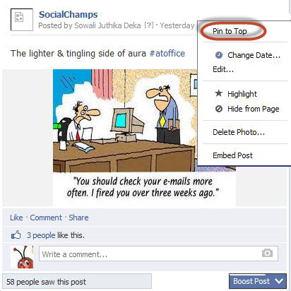
As the page admin, you can still make sure that the first thing page visitors see is the post promoting your apps. No change here.
- Still possible to pin posts to top:
-
- Page posts looking larger now:
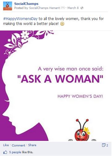
Posts on Facebook pages are 511 pixels wide as opposed to today‘s 410. This is better for your content’s visibility. Since you only have one column now, the pinned post, if you use it, will be even more visible.
- Page posts looking larger now:
-
- Fan posts still visible:
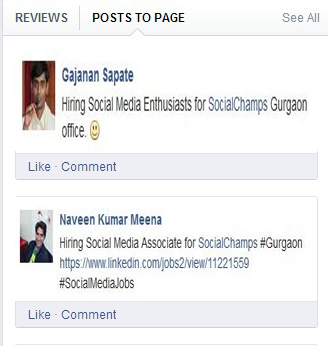
The posts from fans are still visible on the page at left side corner.
- Fan posts still visible:
-
- Easy access to the important admin tools on Pages:
With the new design of the Facebook page, Facebook aims to make access to admin tools easier to page admins. - Bird-eye view for page insights:
All important page insights can be seen and viewed more easily with the new layout of the Facebook page. - Possibility of better quality content on pages:
Most fans do not return to a page after Liking it. They assume that updates from that page would appear in their News Feed. In order to encourage fans to come back to the page, marketers would have to improve the quality of content on their pages. - New tabs:
Page Admins are concerned that their page tabs will no longer be relevant, and would not be visible to their fans. However, the new tab links are much closer in proximity to the News Feed – the old timeline had a whole lot of real estate between page tabs and page posts, which is where engagement occurs. The new layout places the tab links directly above the News Feed and the simple, non-cluttered layout grabs your attention!
- Easy access to the important admin tools on Pages:
-
- Better Admin tools:
New “This Week” Section has been introduced with the new layout of the Facebook page. This means that no matter where you are on your Page, you can now view information about the ads you are running, new likes on your Page, post reach, and unread notifications and messages. You can click on any section in the This Week section for more detail. New navigation options are also available at the top of the Page. This makes it easier to access your activity, insights, and Settings.
- Better Admin tools:
The Build Audience menu at the top of the Page offers direct access to your Ads Manager account.
New “Pages To Watch” Feature allows you to create a list of Pages similar to your own and compare their performance to your own. You will be able to see key stats about the Pages you are watching, as well as the past week‘s most engaging posts from the Pages you are watching.
Not so cool things about the new layout of Facebook pages:
-
- The page header remains on screen after apps are launched:
Page headers are pretty high (360 pixels). Once your app is launched, its content would be low now on the screen. Your users will be forced to scroll down in order to see it. Now users only need to scroll see or enter a contest if you designed it that way. Now there can be fewer clicks and traffic for many apps or contests. - Page suggestions are now displayed within apps:
This is something that no page admin would like. If your app contains a like gate (which is the case in 99% of Facebook apps), users who click the like button will automatically see a widget suggesting other Facebook pages you may want to like. These suggestions are determined by location, category and other pages your fans like- possibly your competitors. This feature can distract your visitors, pushing your app content further down the screen, it’s an invitation for your participants to move immediately to another page displayed in that widget. At this point, for most screens, your app will basically disappear if users do not scroll down to see it again. This can result in poor conversion rates. - The “Like” button less visible now:
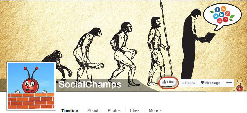
In the current design, the like button is at the top right of the page. It stands alone on a white background which makes it visible and easy to spot. However, in the new design, as the page header remains visible on top of your app throughout the process, the like button has not only moved further to the left but is also on your header image background. This would make it less visible, especially if you have a background with a lot of visuals. You are going to need to change your “click the like button here” visuals to point users in the right direction. Therefore, before you move to the new design, make sure the majority participants on your page understand the new design of Facebook pages otherwise you may lose a lot of participants on your page.
- The page header remains on screen after apps are launched:
-
- Now more investment needed in Facebook advertising?
Some marketers see this as a ploy by Facebook to get pages to invest more in advertising; this move could be evidence that users are not that likely to visit a page‘s timeline and would rather engage with a brand by seeing content in their News Feed. This might result in more advertising getting into more users’ News Feeds? Well, that is up to the individual pages. Facebook may be free for users, but much like any other platform, it is going to cost either time or money (or both) if you want to grow your business or generate sales through Facebook.Therefore, before you move to the new design, make sure the majority participants on your page understand the new design of Facebook pages otherwise you may lose a lot of participants on your page. - Less visibility to the business website:
On the Facebook page, the business put the URL of their website to gain more visits. With the new layout, a visitor would have to scroll down to see the website link. Not everyone is going to do that. This would reduce the hits that a website can get.
- Now more investment needed in Facebook advertising?
Hence, as a page admin or a Facebook user, what is your opinion about the new layout of the feedback? Do you find it cool or disgusting? Share your comments.



0 Comments