
There must be something new in 2020 along with our lives, on social media as well. Facebook being widely used and most content consumed platform by all the aged group people, changing Facebook will make so many lives feel the change in social media change. And so Facebook’s Beta version was launched on Friday, February 7, 2020.
The very basic and easily understandable change is the theme, in the testing version of beta Facebook, they have given two themes, light and dark mode of operations. The load time of the home page is much faster than the earlier though and the main feed is placed in the center which is getting the more attraction of the users while using.
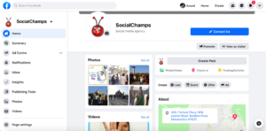
a. The Light Theme of Facebook.
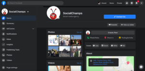
b. The Dark Theme of Facebook.
The personal profile section looks really cool and clear. The placement of so many options is been changed and has put on ease in terms of using it. But of course unless now till the time you won’t get familiar with the new placements it will be a little hard on you.
The UI is more concerned about making the availing the options at the ease to the users so that more people can use and explore more options and features of the platform.
The home page is not running ads in the testing Beta version of Facebook for now and it is amazing, and that is the reason why the load time that the home page usually takes is been lowered sensitively. The update about the business page also looks fine.
All the different options, pages that account is handling and all other tabs are listed up on the left side of the page. And all the options are placed on the screen makes them easily accessible to even new user on the platform, this is the huge plus point of the changed UI of Facebook.
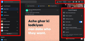
c. Options are on the screen, but occupying more space of feed.
We also found some criticizing points in the new Facebook update.
While going through someone’s uploaded photo, you can’t see the whole photo and comment box in the one screen, you are demanded to scroll the screen if you wish to comment on that particular photo, which might decrease the number of comments that get on usual posts.
The left and the right side of the screen are already occupied by the other options given for ease use but that is taking more space than the daily feed section, which also might be distracting. The sections provided on the right hand which apparently is taking the more space on the screen should be given the facility of minimizing so that people who are interested in it will opt for it, otherwise, it will stay minimized and won’t distract.
Also, seems like the change in the dimensions for the banners of business pages has had happened. The graphic needs to be re-designed by your designer according to the changed dimensions, if so.
Along with this, as mentioned above, the sidebars that the new update has which no doubt making the ease of availing all the options on the screen at the same time but at the same time it is taking more space than the feed is taking on the screen. So there should some arrangement has done regarding it, maybe sliding it inside and popping up on the screen when made a hover. This might also give some good UX for the platform.
This Beta Facebook version is the tasting version so obviously it is not been provided to everyone, but on somebody’s system randomly. Now let’s see how the people respond to it and what further changes Facebook needs to make in order to stay the most hooked up and popular social media platform among others.
Let me know how you did like the Beta version of Facebook and whether it is working well enough for you.




I have seen this changes in my fb account and it is amazing one. Thanks for sharing such article which will help user to understand the beta version in depth. Keep writing and keep sharing
Do visit the blogs for interesting updates!
I want to thank you for this article, with the help of this blog post I got a lot of information about social media marketing and give me an idea to start SMM for my digital marketing business. Keep giving us this information.